

You set a card to width: 280px, but it takes up more space than expected. Adding padding makes it wider again. What is happening?
The answer is the CSS box model. This lesson builds on our rounded card tutorial. You will compare two cards, calculate their widths, and make a card fit a narrow screen. You only need a text editor and a browser.
Meet the four parts of the box
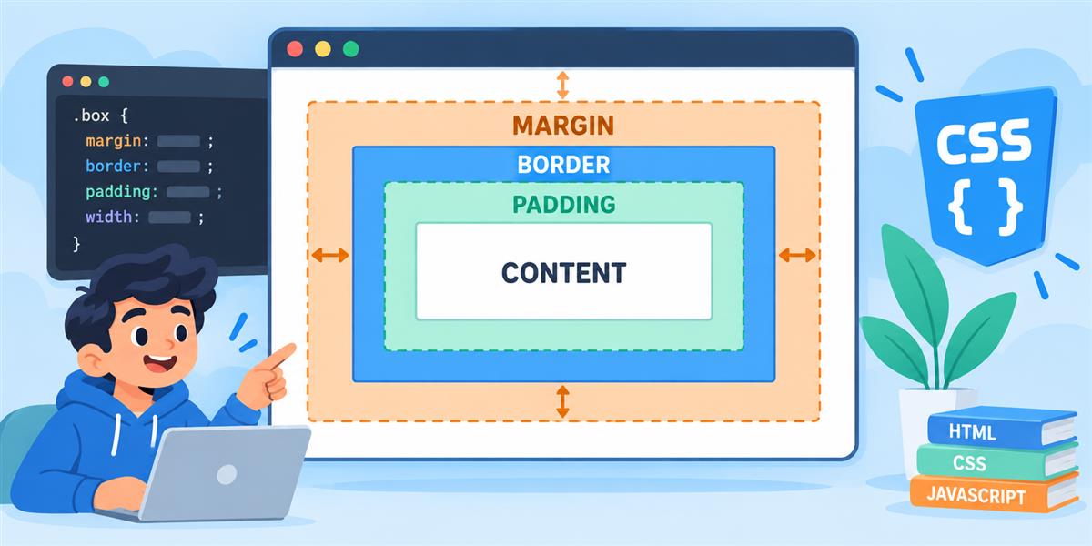
- Content: the text or image inside the element.
- Padding: space between the content and the border.
- Border: the edge around the padding and content.
- Margin: space outside that edge.
Think of a notice pinned to a board. Padding gives the words breathing room inside the notice; margin keeps the notice away from its neighbours.
Why a 280px card becomes 330px wide
The earlier card tutorial uses these values:
.project-card {
  width: 280px;
  padding: 24px;
  border: 1px solid #d8e0ea;
}
For this ordinary block element, the default box-sizing: content-box makes the width apply to the content. Add the left and right padding and borders:
280 + 24 + 24 + 1 + 1 = 330pxThe border-to-border width is 330px. Any left or right margin sits outside that width. A shadow may extend beyond the border visually, but it does not add to this layout calculation.
Build two cards and compare them
Save the complete example as box-model.html and open it in your browser. Both cards have the same width, padding, border, and text styling. Only their box-sizing differs.
<!doctype html>
<html lang="en">
<head>
  <meta charset="utf-8">
  <meta name="viewport" content="width=device-width, initial-scale=1">
  <title>My box model experiment</title>
  <style>
    body {
      margin: 0;
      padding: 16px;
      font-family: system-ui, sans-serif;
      line-height: 1.6;
      color: #172b3a;
      background: #edf6ff;
    }
    main { max-width: 720px; margin: 0 auto; }
    .demo { overflow-x: auto; padding: 8px; }
    .card {
      box-sizing: content-box;
      width: 280px;
      padding: 24px;
      border: 1px solid #255da8;
      margin: 0 0 24px;
      background: white;
      border-radius: 12px;
    }
    .card h2 { margin: 0 0 12px; font-size: 1.25rem; }
    .card p { margin: 0; }
    .border-box { box-sizing: border-box; }
    .demo:focus-visible { outline: 3px solid #255da8; }
  </style>
</head>
<body>
  <main>
    <h1>Two cards, one width value</h1>
    <p>Both cards use width: 280px. Why are they different?</p>
    <div class="demo" role="region" aria-label="Box model comparison" tabindex="0">
      <article class="card">
        <h2>Content-box</h2>
        <p>Padding and border are added to my width.</p>
      </article>
      <article class="card border-box">
        <h2>Border-box</h2>
        <p>Padding and border fit inside my width.</p>
      </article>
    </div>
  </main>
</body>
</html>
What should appear?
You should see two white cards stacked on a pale blue page. The first is 330px wide from border to border. The second is 280px wide. Its content area is narrower, so text may wrap differently.
The comparison area can scroll horizontally on a very narrow screen. That is intentional while we examine fixed widths. Later in this lesson you will remove the need for that scrolling by making both cards flexible.
What border-box changes
.border-box {
  box-sizing: border-box;
}
With border-box, the declared width includes the padding and border. In our second card, the space available for content is:
280 - 24 - 24 - 1 - 1 = 230pxIt still has padding. The padding now fits within the declared width. Margin remains outside the box with either sizing method.
Padding or margin: which should you change?
If the words feel too close to the card’s edge, change padding. If two cards sit too close together, change the space between them. Here, margin-bottom on each card provides that separation.
padding: 16px 24px; /* top/bottom, then left/right */
margin-bottom: 32px; /* space below the card */
In our example, the card’s white background covers the content and padding. It does not fill the margin. Increasing the bottom margin moves the next card down without making the white card itself taller.
For this experiment we give only the bottom edge a margin. In normal block layout, some neighbouring vertical margins collapse rather than adding together. Keep that in mind if two 24px margins do not produce a 48px gap.
Inspect the boxes in your browser
- Right-click the first card and choose Inspect.
- Select the
articleelement withclass="card". - Find the box-model diagram in the Styles, Computed, or Layout panel; the location depends on the browser.
- Compare its content width, padding, and border with the second card.
Try changing the padding in developer tools. Those changes are temporary: copy a useful change into your file, save, and refresh to keep it.
Make the cards fit smaller screens
After comparing the fixed widths, add this rule at the end of your CSS:
.card {
  box-sizing: border-box;
  width: 100%;
  max-width: 330px;
}
Both cards can now grow to 330px, but shrink when their container is narrower. Padding and border are included in that width. Keep the viewport meta element from the complete example.
Resize the browser and try 200% zoom. The text should wrap and the cards should grow taller naturally. Avoid adding a fixed height: longer text needs room.
Your exercise: predict, change, check
Return to the original fixed-width example before doing this exercise. Change the padding from 24px to 16px on both cards. Keep the width at 280px and the border at 1px.
- Predict the border-to-border width of each card.
- Save and refresh.
- Use developer tools to check your prediction.
- Change only
margin-bottomfrom 24px to 40px. Watch which space changes.
Show the answer
The content-box card becomes 314px wide: 280 + 16 + 16 + 1 + 1. The border-box card stays 280px wide; its content area becomes 246px. Changing the bottom margin changes the gap below the card, not its border-to-border width.
Common mistakes
- The page still overflows: check for fixed widths, horizontal margins, or a long unbroken word. Border-box helps with sizing, but it does not solve every overflow problem.
- Your rule seems ignored: save and refresh, check the class name, and look for a later rule overriding it.
- The heading adds unexpected space: headings and paragraphs have default margins. Our example sets those explicitly.
- You used width on a normal inline span: this lesson uses block-level cards. Inline text elements do not follow all the same sizing behaviour.
Keep practising
Apply the flexible sizing rule to your rounded project card, then move the rules into a separate style.css file. When spacing makes sense, try the Flexbox navigation tutorial to arrange several items together.
Further reference: MDN’s CSS box model guide.