

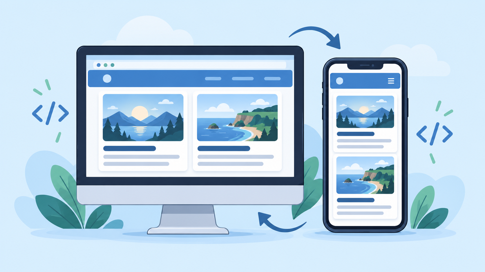
Your first website looks good on your computer. Then you open it on a phone: the text is tiny, the cards feel cramped, or you have to scroll sideways.
How do you fix it?
Start with a flexible layout. In this tutorial, you will build a small hobby page that shows one column on narrow screens and two columns when there is enough room. You only need HTML and CSS.
Your goal: a page you can comfortably read and use on a phone, tablet, or computer.
Start with the smallest layout
A useful approach is to design for a narrow screen first. Put your content in one column, make it readable, and add columns when the available space allows it.
This approach is called mobile-first design. A media query lets you apply additional CSS when the browser reaches a chosen width. Read more about responsive design on MDN.
Build a responsive hobby page
Open the Playcode123 Sandbox. If you already have work in the editor, download it before replacing it.
Paste this complete example into the editor and choose Run Code:
<!DOCTYPE html>
<html lang="en">
<head>
  <meta charset="UTF-8">
  <meta name="viewport"
        content="width=device-width, initial-scale=1">
  <title>My Photography Page</title>

  <style>
    * {
      box-sizing: border-box;
    }

    body {
      margin: 0;
      padding: 1rem;
      font-family: Arial, sans-serif;
      line-height: 1.6;
      background: #eef4fa;
      color: #172b4d;
    }

    main {
      max-width: 60rem;
      margin: 0 auto;
    }

    h1 {
      line-height: 1.2;
    }

    .cards {
      display: grid;
      grid-template-columns: 1fr;
      gap: 1rem;
    }

    .card {
      min-width: 0;
      padding: 1.25rem;
      background: white;
      border: 1px solid #cbd5e1;
      border-radius: 0.75rem;
      overflow-wrap: anywhere;
    }

    .card h2 {
      margin-top: 0;
    }

    a {
      color: #174ea6;
    }

    a:focus-visible {
      outline: 3px solid #174ea6;
      outline-offset: 4px;
    }

    @media (min-width: 44rem) {
      .cards {
        grid-template-columns: repeat(2, 1fr);
      }
    }
  </style>
</head>

<body>
  <main>
    <h1>My Photography Page</h1>
    <p>
      I enjoy noticing small details and turning
      ordinary moments into photographs.
    </p>

    <div class="cards">
      <section class="card">
        <h2>What I enjoy</h2>
        <p>
          My favourite subjects are trees, buildings,
          and changing light.
        </p>
        <a href="#next-project">See my next project</a>
      </section>

      <section class="card" id="next-project">
        <h2>My next project</h2>
        <p>
          I will photograph the same place in the morning
          and evening, then compare the results.
        </p>
      </section>
    </div>
  </main>
</body>
</html>
The preview should show two white cards. Their arrangement depends on the width of the preview area.
Understand the important parts
The viewport setting
The viewport meta element helps mobile browsers lay out the page using the device width. It does not automatically fix content that is too wide.
A maximum width
max-width: 60rem keeps the main content from becoming excessively wide. Unlike a fixed width: 960px, it allows the page to fit a smaller space.
One column first
grid-template-columns: 1fr creates a single flexible column. The cards can grow vertically as their text wraps.
Two columns when there is room
At 44rem and above, the media query changes the grid to two equally sized columns. This is the example’s breakpoint: the width where its layout changes. Choose breakpoints that suit your content, rather than trying to target every phone model.
Test the page outside the editor
Choose Download HTML and open the downloaded file in your browser. Make the browser window narrow, then wider.
Check that:
- The cards stack on a narrow screen.
- They sit beside each other on a wider screen.
- Text remains readable without sideways scrolling.
- The internal link takes you to “My next project.”
- At 200% zoom, content remains available and readable.
If possible, also open the page on a real phone. Resizing a desktop window is useful, but it does not test touch interaction.
Adding a photograph
When you add an image, use a working file path and a description that suits the photograph. These CSS rules help it fit its container:
img {
  display: block;
  max-width: 100%;
  height: auto;
}
For help with image paths, read Using PNG Images in a Webpage.
If your page still scrolls sideways
Look for the element that is too wide. Common causes include a fixed-width container, a large image, or a long unbroken URL.
Avoid using overflow-x: hidden as your first fix. It can conceal the problem while cutting off content.
Also avoid fixed heights on text cards. A paragraph needs more vertical space when it wraps into additional lines.
If padding makes your cards wider than expected, review the CSS box model.
Your challenge
Change the page to your own hobby. Add a third card with a longer paragraph, then test it at narrow and wide widths.
Before you finish, explain which rule changes the number of columns. If you can make the change and explain the result, you are learning how the layout works.
Continue with Make your page work on a phone, then apply the same checks to your own website.